TL;DR
Imagine ordering, tracking, and enjoying meals that fit your diet needs and goals all in a single place. I designed a mobile app to address the problems of low nutritional awareness and limited options in my hometown.
In this project case study, I describe how I applied the design thinking process to connect customers with a local restaurant that provides customized meals and other diet solutions to specific individuals. By doing so, the app also benefits the business by improving customer satisfaction, loyalty, efficiency, and revenue.
*Kinmuni is a fictitious restaurant and a direct representation of a local restaurant in Vientiane Laos. I designed Kinmuni to avoid any copyright issues.

INTRO
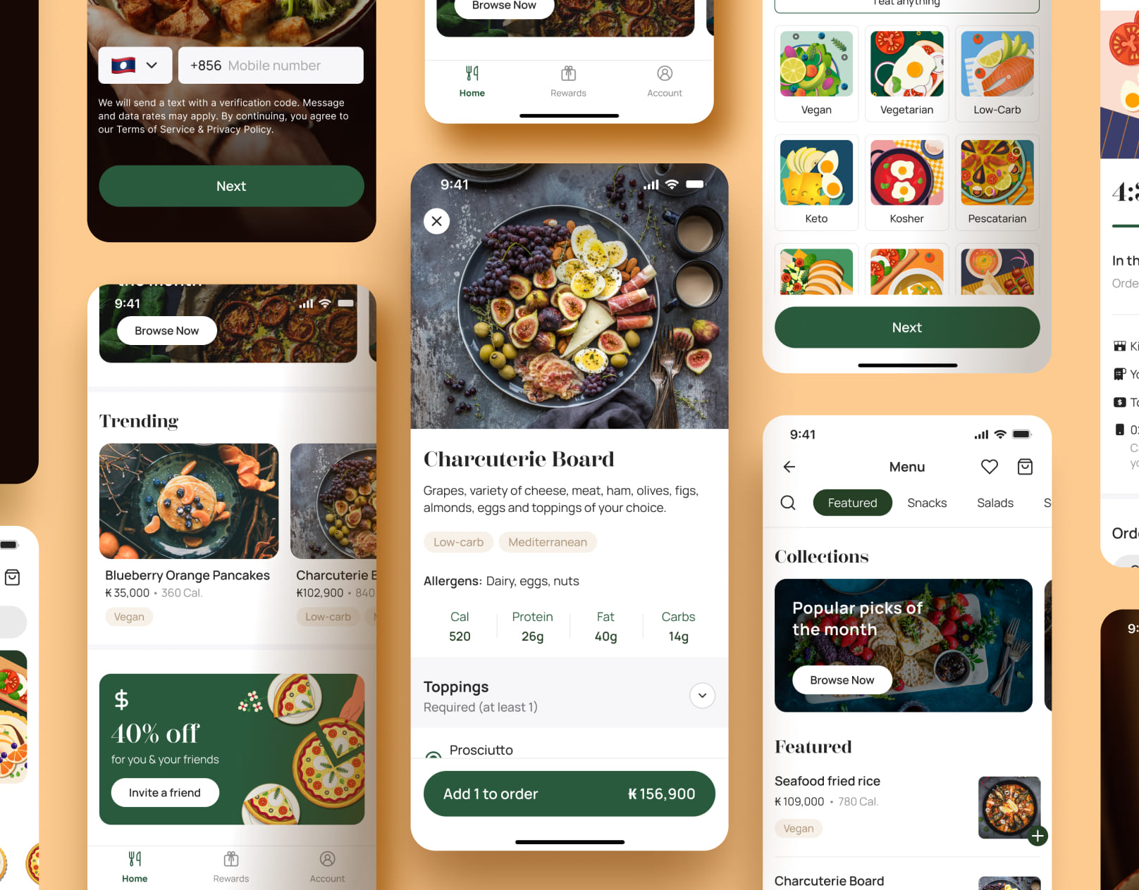
Eating well is a right, not a privilege. But many people struggle to make healthy, informed food choices due to various barriers. That’s why I designed the Kinmuni app, a nutrition calculator app that helps people manage their diet plans, customize their orders, and enjoy personalized meals from a local restaurant.
The Kinmuni app was inspired by the Sharpen challenge — to design a nutrition calculator app for a local restaurant. I chose Kinmuni to represent a cozy café in my hometown that serves a diverse range of customers from locals to travelers, and foreigners.
To understand the needs and challenges of potential users, I conducted impromptu discussions and interviews with people who have different dietary preferences and goals. I discovered that many people want to eat healthier, but they face barriers such as lack of awareness, information, motivation, time, and money.
With the Kinmuni app, I aim to overcome these barriers for many users by providing them with the convenience and flexibility in managing their diet plans. The app allows users to put together an ideal meal plan, adjust key ingredients to meet their diet preferences, and schedule meals to their convenience. The app also connects with the restaurant’s kitchen system to streamline the meal preparation and delivery process.
01 Understand
CONTEXT
Kinmuni is a well-known cafe in Laos that serves a diverse range of customers with different needs and preferences. It offers a variety of delicious and nutritious meals, as well as coffee and baked goods. It also supports social causes and changes its menu according to the seasons. However, the cafe has some limitations that affect its customer satisfaction and loyalty. Some of the problems are:
- Long queues: Customers often experience frustration and delays due to the need to queue up at a single cashier to place their food orders. This is worst during busy hours.
- Lack of info: Customers have limited information about the food they are ordering, such as the nutrition, ingredients, descriptions or pictures. They are limited to a list of names on the menu board.
- No loyalty program: The cafe does not offer any convenience or incentive for customers who want to order their food in advance or return frequently. It does not accept phone orders, and it does not have any loyalty program or rewards.
- Menu accessibility: The absence of an accessible menu makes it difficult for customers to know what food options are available and make informed decisions. For customers dining alone, leaving their seats to order food can be inconvenient and potentially unsafe, especially if the cashier is located far away.
These issues hinder the cafe from delivering a personalized and satisfactory customer experience, as well as realizing its full potential.
USER RESEARCH
I conducted informal and semi-structured interviews with cafe-goers, entrepreneurs, and business owners to explore their lifestyle, well-being, challenges, and opinions about the nutrition calculator concept.
Open-ended questions were asked to encourage participants to share their thoughts and experiences in their own words. I also observed participants as they interacted with their surroundings and each other to gain a deeper understanding of their needs and motivations.
The four main questions I focused on were:
- What are your biggest struggles when it comes to achieving your dietary goals?
- How does your busy lifestyle impact your ability to achieve your diet goals?
- How important is it to you that food orders be personalized to align with your dietary requirements and preferences?
- How open are you to engaging with a restaurant app to access nutrition information?
Three types of personas were identified during the discussions, which represents the main pain points and goals of Kinmuni’s target users.
- Weight management seekers: Individuals from this group desires to lose or gain weight and need reliable dining solutions to ensure that they are eating the right amount to achieve their goals. Fitness enthusiasts and coaches also belong in this group.
- Busy professionals: Customers have limited information about the food they are ordering, such as the nutrition, ingredients, descriptions or pictures. They are limited to a list of names on the menu board.
- People with dietary restrictions and conditions. These are individuals who have to be sensitive about what they eat due to medical or personal reasons. This includes temporary conditions like pregnant or breastfeeding mothers.
USER PERSONAS
Using the research data, I created user personas that represent the needs, goals, and behaviors of the potential users of Kinmuni. These personas helped me to establish a clear and realistic picture of who I was designing for and how they would interact with the product.


02 Explore
BRAINSTORMING SOLUTIONS
The Crazy 8s method was used as a starting point to design Kinmuni’s wireframes. Each session follows the best practices stated by Google, which includes listing its elements beforehand, providing clear labels, and combine ideas to innovate. A sample of 2 screens are available below:


BUILDING THE SOLUTION
Once the designs of each screen wireframes were decided, I designed the first set of digital wireframes, refined them, and prepared for the first user testing.


03 Materialize
TESTING THE SOLUTION
To evaluate the usability and desirability of the Kinmuni app, I planned and conducted a moderated usability study with 6 participants who matched the target user profile using ethical and best practices outlined by the UX team at Google.
Kinmuni Usability Study Plan. A Google document outlining the study introduction, research questions, KPIs, methodology, participants, scenarios.
During the moderated usability study, I used instruction cards to guide the participants through different tasks on the app, such as getting started with the app, browsing menus, checkout, and save their order in their own ways. The participants were also encouraged to think aloud and share their honest opinions and feelings about the app.
Usability testing instruction cards. A deck of instruction cards used during user testing.
PRESENTING THE STUDY
The study revealed valuable insights about the app’s features, navigation, language, and overall concept. Based on the feedback, I made several iterations to improve the app’s design and functionality.
The key insights from the testing phase were then compiled into a usability study deck to be presented to the stakeholders.
Kinmuni App Usability Presentation Deck. A Google slide of the usability study. Project background, research questions, participants, methodology, prototypes, research themes, insights and recommendations.
ITERATING THE SOLUTION
The wireframes are then revised based on user feedback and iterated for another round of moderated usability study. Once ready, a high-fidelity prototype was designed, refined, tested, and iterated following the design thinking process.

To view the minimum viable product and visual presentation of Kinmuni, please visit my Behance presentation in the link below:
https://www.behance.net/gallery/173756889/Kinmuni-Product-Design
Thank you for your time, I hope you enjoyed the journey!
Please don’t hesitate to provide any feedback, comment, or reach out to me directly via LinkedIn 👋 It would be my greatest pleasure to connect with friends, brothers, sisters around the globe.
Stick around with my other case studies if you have time to spare 😉 or if you’re feeling more visual, there’s much more to see on my Behance showcase 🤓
Leave a Reply